
How to: Change colors of a custom report
If you want to change the colors of series in a graph: Select the graph you want to change, then click on the settings button, and click on Palettes: Then choose an existing palette, or create your own: Click on OK, and look at the modifications applied: You also can customize datagrid content (colors, borders, fonts, etc.) You just…
If you want to change the colors of series in a graph:
Select the graph you want to change, then click on the settings button, and click on Palettes:
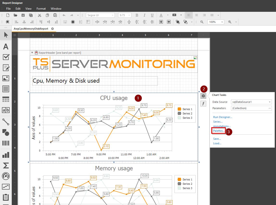
Then choose an existing palette, or create your own:
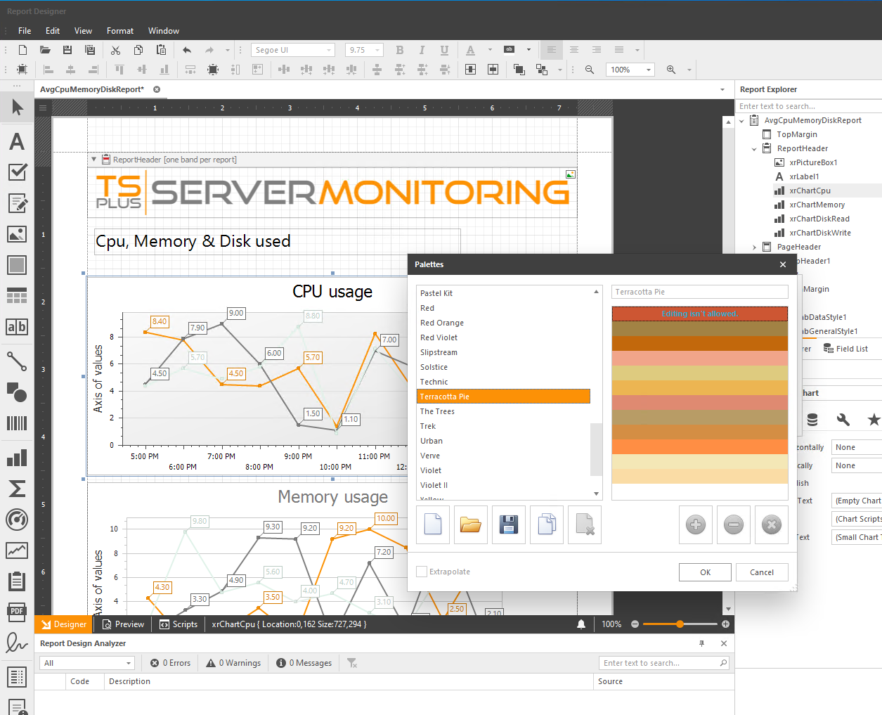
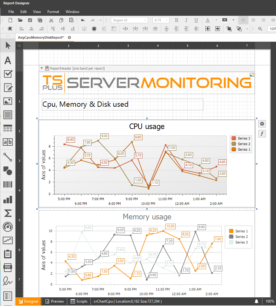
Click on OK, and look at the modifications applied:
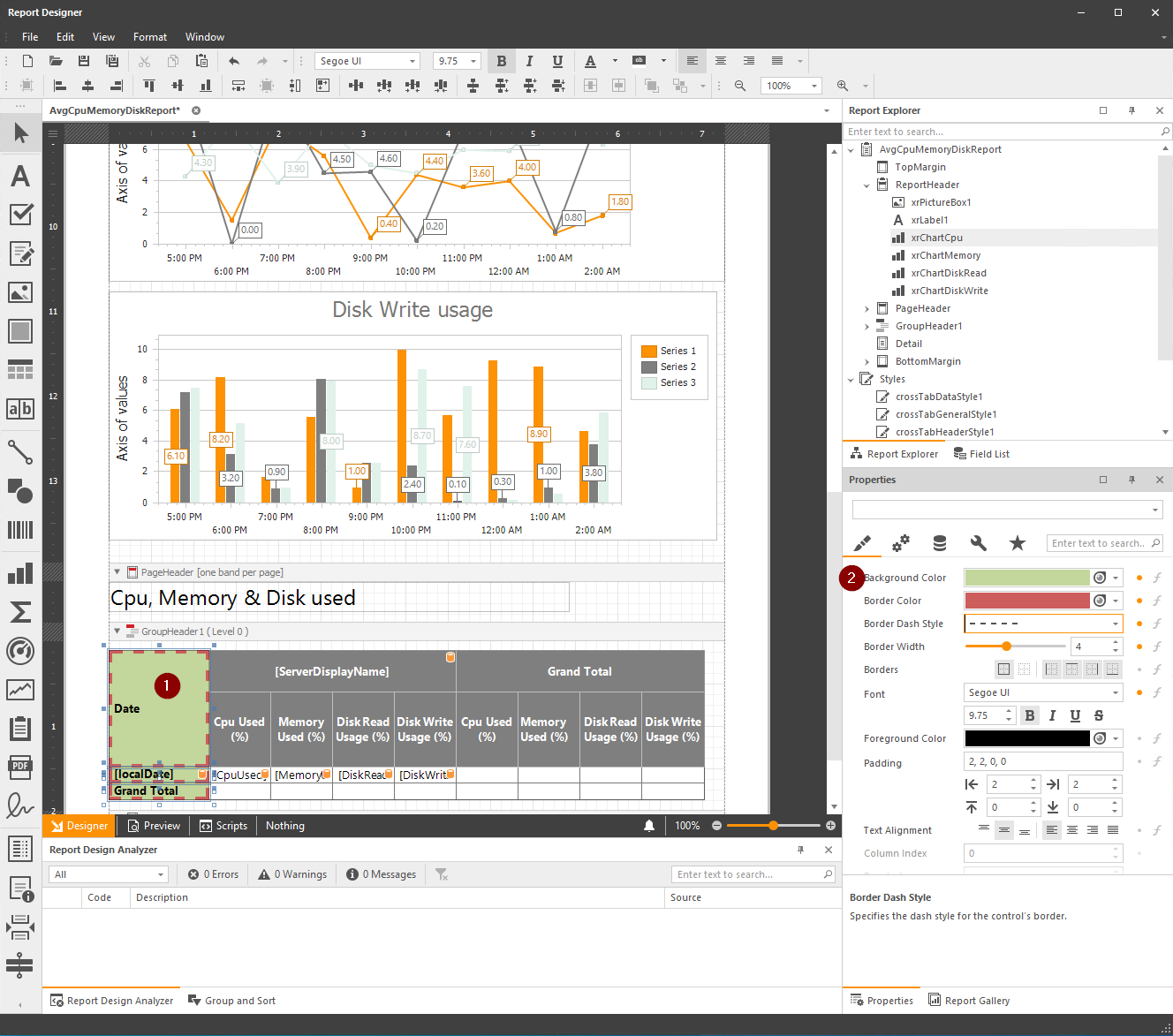
You also can customize datagrid content (colors, borders, fonts, etc.) You just have to select the cell(s) you want to modify, and modify the properties you want:
Need help with this topic?
The TSplus Türkiye team can help you validate the configuration before production rollout.